Showing posts with label label design. Show all posts

Thursday, 1 May 2014

less geisha, more ghost


The beer label visuals progress, pretty much along the route of this post title!


Update: so the Green Lady Brewing Co. are happy, give or take some minor adjustments I've still to make. I'm so excited to see it on bottles, on actual shelves! I will be posting pics!

Sunday, 27 April 2014

green lady


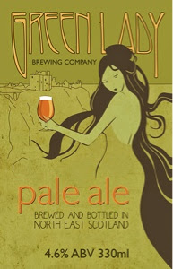
Finally! I've been working on the beer label design for the Green Lady Brewery Company. As the brewery-cum-wineshop is housed in a pretty impressive art deco building, I wanted the label to reference that a little, while still being modern.


So, for inspirado, I turned to the books of Vogue covers and 1920s fashion illustration I bought when I was, gosh, 15! I looked at these so often as a teenager, even decades later I still know nearly all the illustrations by heart.

Just to mix it up, and because I thought the green lady - a ghost who supposedly haunts the brewery of Dunnottar Castle - should be slightly more ethereal than a 1920s flapper, I channeled another of my teenage obsessions in the form of some Alfons Mucha style art nouveau.

(As an aside, it would seem nearly all Scottish castles are haunted by a green lady, so make of that what you will!).


Here's first look at the initial visuals. To keep it current and add shelf impact, I've added a slightly irreverent bottle of beer (a nod to the ubiquitous flapper cigarettes which were obviously Vogue illustrator shorthand for an emancipated lady!) and rendered the illustration in a flat, solid colour graphic style (flat design is everywhere at the moment).

Still some fairly major tweaking of layout and typography to do, and that's assuming the Green Lady Brewing Co. are even happy with the direction the artwork is taking, but I'm pleased with how the visuals have turned out so far...

Saturday, 22 February 2014

good things come


Little things make me happy: this weekend's delicious Spanish red, the label of which is featured in the contemporary wine label design book I recently acquired as research for the beer label project. 

As a design theme it works brilliantly: according to the blurb, Matsu is a Japanese word that translated into English means "to wait". But Dunnottar Wines, my local wine emporium, doesn't stock the older dudes - I guess as you would expect, they're featured on the finer Matsu vintages. (Not, incidentally, a metaphor that necessarily holds true outside of the wine world...).

As an aside, I downloaded the snapseed app to edit the image on the iPad... and I like it! It's more intuitive than PS express and has a bunch more filters and textures. Best of all, it's free. And, as the blurb on the website where I found it said: "Snapseed: only you can decide whether to make your photos approximately 72 per cent more ominous"!!! Recommending...

Monday, 27 January 2014

off the shelf


I think I've already said, but I'm super excited to be designing the beer labels for new, upcoming Stonehaven tipple, the Green Lady. I'm a regular visitor to the fabulous Dunnottar Wines, who will be brewing the brew, and not just because no.1 son is the manager! This time though, it was for genuine beer label research (although I did pick up a hitherto untried 2011 Malbec while I was there...).


So, I'm currently swotting up on all things label design (bliss!), and also managed to use the drawing of ghostly, elfin type creatures as an excuse to purchase a mini copy of Lady Cottington's Pressed Fairy Book, which I have coveted for years (nay, decades!). It doesn't get much better!