Showing posts with label graphic design. Show all posts

Thursday, 1 May 2014

less geisha, more ghost


The beer label visuals progress, pretty much along the route of this post title!


Update: so the Green Lady Brewing Co. are happy, give or take some minor adjustments I've still to make. I'm so excited to see it on bottles, on actual shelves! I will be posting pics!

Sunday, 27 April 2014

green lady


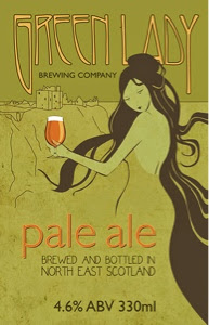
Finally! I've been working on the beer label design for the Green Lady Brewery Company. As the brewery-cum-wineshop is housed in a pretty impressive art deco building, I wanted the label to reference that a little, while still being modern.


So, for inspirado, I turned to the books of Vogue covers and 1920s fashion illustration I bought when I was, gosh, 15! I looked at these so often as a teenager, even decades later I still know nearly all the illustrations by heart.

Just to mix it up, and because I thought the green lady - a ghost who supposedly haunts the brewery of Dunnottar Castle - should be slightly more ethereal than a 1920s flapper, I channeled another of my teenage obsessions in the form of some Alfons Mucha style art nouveau.

(As an aside, it would seem nearly all Scottish castles are haunted by a green lady, so make of that what you will!).


Here's first look at the initial visuals. To keep it current and add shelf impact, I've added a slightly irreverent bottle of beer (a nod to the ubiquitous flapper cigarettes which were obviously Vogue illustrator shorthand for an emancipated lady!) and rendered the illustration in a flat, solid colour graphic style (flat design is everywhere at the moment).

Still some fairly major tweaking of layout and typography to do, and that's assuming the Green Lady Brewing Co. are even happy with the direction the artwork is taking, but I'm pleased with how the visuals have turned out so far...

Saturday, 8 March 2014

picture it


A little graphic I knocked up to illustrate the figures in the Standard and Poor's report on an independent Scotland. Mainly because I don't think they're getting the attention they deserve and it's always easier to visualise than wade through a dry report, but also as an old design colleague of mine has created a site where I now have an outlet for this stuff! It's still in its infancy, but already boasts Alan Bissett as a follower - not too shabby! Anyone can post, just contact Gordon through the site and he'll let you know how.

Another of our ideas was to have an Instagram gallery of Yes Scotland signs from around the country, #ayescotland - so if you see any, please take a pic and upload, alternatively send them to me and I'll do it for you!

Monday, 10 September 2012

seriously?


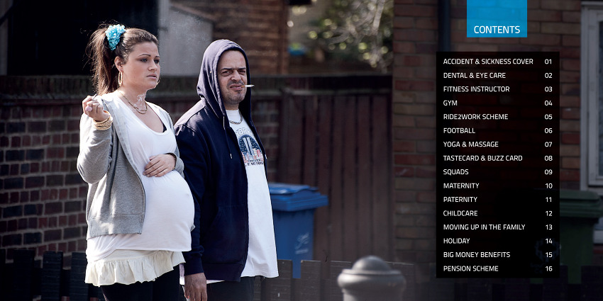
Apologies that my first post in ages is a rant, but it is at least vaguely design related. If you want an insight into what the great and the good actually think of benefit claimants then you need look no further than the internal staff benefits document produced by advertising agency Iris. 

Cunningly titled 'Iris on Benefits' (see what they did there?), it features such lovely stereotypes as a pregnant woman smoking, childcare down the pub and what are presumably teenage shoplifters. While my first temptation was to laugh (it's supposed to be a parody of that awful 'Shameless' programme, which isn't funny either), that Iris has won several lucrative government contracts (including campaigns for benefit changes and, good grief, the Olympics) tells us all we really need to know about how the 'upper classholes' - to borrow from the new series of The Thick of It' - view the most vulnerable members of society. So on reflection it's not just nasty, it's downright shameful.


Monday, 23 April 2012

through a lens


I have something to post for once, so I’m going to ignore the fact I’ve not visited here for a while and blunder on regardless...

You’ve probably seen the small, square, grungy-looking retro camera images that are everywhere just now, and if you’ve been a previous follower of my blog you’ll know I’ve definitely not been immune to the trend. Ahem. Much as I love it, I’m not deluded enough to think my, err, Hipstamatic iPhone app makes me a photographer. But....... (you knew there was a but coming right?) these grimy washed out images have their uses (apart from making everything nostalgic of course) and in this case they were prefect for capturing the faded elegance of beautiful Budapest. Photographs can never convey the full sensory reality of a location, but the skewed colour and ever-so-slightly-disconcerting light leaks, combined with their timeless quality, tell the story of Budapest far more powerfully than an ordinary photograph could (I took two ‘normal’ photographs while I was there, but neither came close to conveying my experience. I deleted, so I guess you’ll have to trust me on this one).


If I had time I could witter on for ages about the city, but I don’t, so suffice to say its turbulent past got me reading... and, while I was obviously on the lookout for my preconceived notions of eastern European illustration, there was a flourishing (and v modern) design culture there that also got me inspired... Actually, it all feels so goddamn energetic that it can’t help but rub off a bit. Expect more posts (and yes, perhaps even some actual work!) from here on...

Wednesday, 11 May 2011

near and far

“Originally about me leaving behind the cut throat world of corporate design and becoming a freelance illustrator”


So says the spiel down the side of this blog. The process began in 2005 while I was still working full time as senior designer, now six years on I have a part time job I love with a music education organisation and, until the end of last year, a growing freelance business.

I’ve been incredibly lucky with the projects I’ve worked on and met many wonderfully committed and creative people but, with the funding for so many arts organisations (including my own) increasingly uncertain, it’s doubtful whether the myriad cultural festivals and arts events I‘ve had the pleasure of working with in the past will now happen at all. If they do, it will almost certainly be with a vastly reduced budget for design and illustration.

With this in mind (and combined with an irritatingly inconvenient need to eat, darn it!), I guess for now the spiel is changing… wheels have been set in motion to leave the world of freelance illustration and rejoin the world of corporate design.

More positively, the time spent promoting my work and sourcing new freelance clients can now be used to work on the much neglected growing boy.

Tuesday, 22 February 2011

new direction [or back to my graphic roots]


I have been messing around with this pesky owl for the last few days now and I think, after a shaky start, me and him have finally reached a tentative understanding.

Right now he's a pen and ink illustration with a smidge of digital chucked in, but I reckon he'd be much, much happier as a linocut. Then again perhaps that's me projecting... I have been having a creative crisis of sorts lately. After much soul searching and angst (mostly involving the poignant midnight munching of mucho Mini Cheddars) I've come to the conclusion I'm in a rut and in dire need of a new and exciting way of working, and printmaking is something I've always had a hankering for. Unfortunately as time, responsibilites and funds don't allow for a 5-day workshop in the Italian hills darn it, I'm thinking some linocutting tools might be the very thing. Watch this space.

But this is by way of preamble, because my little feathered friend is about to become the subject of my fabulous, incredible, spectacular (and wise) 50+ followers owl giveaway, so watch this space x2.

Friday, 2 July 2010

get a grip hen...

...that's what I imagine, in my deeply ignorant fashion, is what someone from the West of Scotland might have said to me the other day if they had witnessed my frantic multi-tasking and ensuing panic. I have a new illustration project (the benign hen above will feature) and some straggling design projects, like the fiddle festival work below, which stubbornly refuse to end despite my best efforts. All a bit manic. Which is good I guess, but also mucho stressful.


Tuesday, 24 November 2009

polka dot robin [or berry christmas!]

I'm working out a Christmas card design based on my cupboard folk art birds. I've produced homemade cards before, but this year I'd like to do something a little more elaborate in design and get them printed up. As usual though, I've left it a bit last minute! This is the rough, which going to try and produce completed artwork for this week (between pet portraits and the puppet festival design work...).

Wednesday, 19 August 2009

designing (not illustrating)... boo


Lots of design work is keeping me from working on my book... (but is paying the bills)


Not too bad, at least they're all music or arts related - nice people to work with and interesting to do (plus I get to find out what's on first!).

Thursday, 2 April 2009

echo exhibition


I received a photograph of the finished Echo the Bat panels by email this morning from Heather at Creative Link Fife. The panels were output at A0 and formed the centre of a larger exhibition. I wish I'd made it down to the exhibition to see them in person, I would have liked to see how the illustrations looked blown up to this size!
Meanwhile, I've had my invitation for the next Italian children's illustration exhibition. The theme this year is 'earth' - mulling over whether I can come up with something and get it to Italy before June...